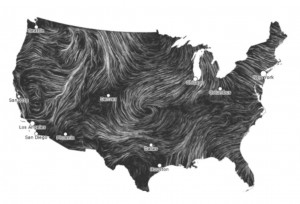
Click on this screenshot and savor the beauty that is simply wind blowing around the United States.
Now can there be any doubt we have enough wind to make a serious contribution to our voracious energy demand?
The interactive map doesn’t tell us a thing we didn’t already know – the data that drives it comes from the National Weather Service – it just tells us in a sublime way. “These are near-term forecasts, revised once per hour,” say the creators. “So what you’re seeing is a living portrait.”
The U.S. government envisions generating 20 percent of our electricity through wind by 2030.
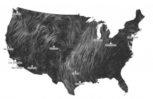
The Wind Map is a product of two people who lead Google’s “Big Picture” visualization group in Cambridge, Mass., Fernanda Viégas and Martin Wattenberg, The gallery section of their site showcases some particularly striking animations, including this one from March 14:
(Click on the image above to see the animation.)
Wonder if it was a starry night.

