I kept an eye out for branding innovation at Greenbuild 2010 as I maneuvered my way along (what felt like) miles of floor featuring over 1,000 exhibitors and 25,000 attendees.
- Social responsibility alignment – besides the typical association with energy saving and planet-survival, some Greenbuild companies extended their brands beyond the oh-so-obvious. Accoya, for example, had a “Sign our wall” fundraising effort with every signature translating into $10 for Haiti rebuilding. Other companies displayed Susan G. Komen for the Cure pink ribbons. Shaw asked people to respond to Twitter queries so it could donate $1 to the Make It Right Foundation, helping rebuild the Hurricane Katrina-devastated Lower 9th Ward in New Orleans. Good for them, good for the world.
- Transparency – Interface Floor won my prize for branding transparency. A massive graphic displayed above their booth featured a black and white illustration of a brain beside a barrel of oil. Their messaging platform: “Be smarter than oil.” Gradually leaving its oil industry connections behind, the company’s mantra is zero environmental impact by 2020. Clear messaging permeated the booth on laminated cards: “16 years and counting to becoming a sustainable company…” Other companies shy away, evade or obfuscate; this brand appears to be living its stated mission.
- Personal reinvention – David Gottfried wore shoes as he autographed free copies of his book “Greening my life.” The founder of USGBC (U.S. Green Building Council) and LEED standard creator personalized his brand, sharing insight into his personal transformation from hard-charging empty life exec to green-inducing happiness. Kudos for having the guts to share lessons learned with others.
- Promotions – not surprisingly, the top tease prize at Greenbuild 2010 was the iPad. Several companies featured iPad promotions including Dupont and NCI Group. My favorite giveaway? The cool hybrid Sanyo Eneloop bike.
- Living its mission – While 80% of Greenbuild 2010 exhibitors are indistinguishable (packing too many products, imagery and pleas into every corner of space), Dyson stood out with its “less is more” approach. Only two products were featured: hand dryers and bladeless fans. The booth was white, spacious and all messaging was tightly displayed on five panels. Copy was simple and memorable, contrasting the way it used to be with the way it is now (thanks to Dyson).
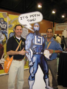
 Let’s have fun – Next time a company or client says “our stuff is in the weeds; we can’t do much creatively” remember Bluebeam. This company essentially has a better Adobe: a PDF based real time project collaboration file management tool. Yawn. But Bluebeam made the mundane come alive with its “Mighty Bluebeam” cartoon character, case studies galore, comic books, exhibit booth worker matching t-shirts and fun messaging like “It’s PDFin’ time!”
- Interactive messaging – Most companies struggle with messaging. Not only trying to explain what they do, but also finding clever ways for people to “get it” and relate. Kudos to SYNLawn and SAGE for doing both. The former divided its narrow booth into three sections, allowing visitors to putt on a golf course, feel astro turf in a stadium and stand on a front lawn at home. Dynamic window maker SAGE (disclosure: client) made its “Power to change” tagline come alive several ways, including windows showing multiple exterior views and an interactive exhibit where visitors pressed a button and the glass transformed. Whenever messaging can be experienced like this, it’s a very powerful thing.
- Green nation building – standing out from a sea of corporate sameness were… countries. Scandinavia, Canada and France all sent delegations to Greenbuild 2010, positioning themselves – via products, technologies and companies – as green-inspired economies.
